

Client: Newton
Year: 2024
Location: London, UK
Services: Branding and Identity design, artworking with print and digital assets.
↓
Newton
Food For Thought is an intimate roundtable dinner series hosted by Newton Europe, created to bring together leaders and specialists from across a broad range of business sectors. Each event is designed as a space for open dialogue, where guests can exchange forward-thinking ideas and explore emerging opportunities within the ever-evolving world of retail markets. With topics shifting from session to session, the series acts as a catalyst for meaningful conversation, cross-industry insight, and fresh strategic thinking.
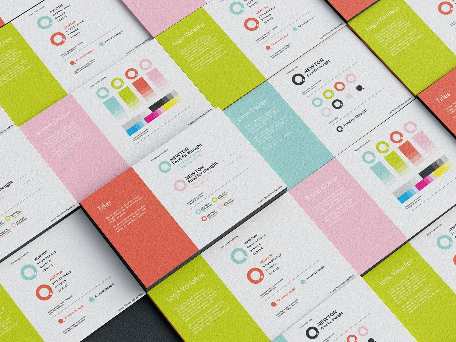
Our design approach focused on capturing the interactive, conversational nature of these gatherings while ensuring that the experience felt warm, accessible, and thoughtfully curated. We developed a visual direction that balances sophistication with approachability, allowing the brand to feel premium enough for senior-level audiences, yet relaxed enough to encourage genuine, unguarded discussion.


Maintaining consistency across events was essential, particularly given the series’ fluid structure and frequently changing themes. We built a flexible identity system that can adapt to different sectors and subject matters without losing coherence. From printed menus and table pieces to digital invitations and presentation assets, every touchpoint reinforces the character of Food For Thought: engaging, open, and always attuned to the fast-paced rhythm of the retail landscape.
